Sunday 29 August 2010

Life Drawings

____The following are from 3 Life Drawing classes I took when I had time in my final year at University. Now I know how important they are for animation and for general drawing skills, I wish I'd made time to do more and to abuse the aspect that they were free!

I quite enjoyed them (which I really wasn't expecting to!) and was quite pleased with the results.


Class One

Photobucket

Photobucket

Photobucket


Class Two

Photobucket

Photobucket

Photobucket


Class Three

Photobucket

Photobucket

Photobucket

Friday 20 August 2010

Edited Drawings

____The following images you may recognise as the drawings from my previous post, but edited in Photoshop using a Threshold/Stamp effect to capture just the darker features of their faces and make them almost silhouette-like.

I was experimenting with this a while back and decided to put bright, block colour backgrounds behind them, which gave them a Punk-esque feel to them. Since I had several of them, I decided to stick in a quote for each and make them collectively the Seven Sins.

Photobucket

Photobucket

Thursday 5 August 2010

Drawings

____I suddenly had the urge to do some more sketches today, so I am going to do some more at present. I remembered I had a bunch of face sketches, tonal drawings and Photoshop coloured drawings too, so I thought I'd put them on here. They're all on DeviantArt though, but I haven't updated it much recently.

I think I did these over time from 2006-early 2010. All of varying detail/varying precision, but I feel they get better over time. Much bigger versions of each drawing and more can be found here.

Photobucket

Photobucket

Photobucket

Photobucket


Moving onto Photoshop-coloured drawings..
These were done as simple line sketches (some with more tone at first perhaps), and then in Photoshop had colours and tones/highlights applied.

Photobucket

The above was the first one I ever did, and I still believe (annoyingly) is the best one I have done so far. The tones just seem to click straight away and work much easier than the rest.

Photobucket

Photobucket

Photobucket

Photobucket

Sunday 1 August 2010

One Dot Zero "The Disappearing City"

____The third project of my final uni year. This brief was very open in that the only guidance we had was to create a motion piece interpretting "The Disappearing City" in any way you wanted. I ended up reading it as something about Deforestation, although I wish I'd gone with other, more direct, ideas.

I created an advert raising awareness of deforestation, although I wish I'd concentrated more on the message at the start. Once I'd finally come up with an idea on what I could do it about, it was a rush to get the thing finished!


Overall, I actually was pleased with the style of animation most. I spent too long trying to work out how to make a nice pop-up book, which contradictingly needed more time to develop it.

Saturday 24 July 2010

Advertising: HIV Awareness

____Another little project I just uncovered was a self-directed brief from my first year of uni. Quite similar to my 'toast' brief, I made up one that would aim to raise awareness of HIV.

The originals I did at University follow, but I wanted to show the more recent remakes of this project first.

Photobucket

Given more time I would redo the photographs, incorperating the red ribbon into the actual photos themselves which would make them easier to Photoshop the colour. This would also give me the opportunity to experiment with where to put the ribbon, for example, tying the two holding hands together.


These are the originals I came up with in June 2008.

Again, much like picture-taking time in the Gamecity project, my friends were not amused!

Photobucket

Photobucket

Photobucket

(excuse my dreadful Photoshopping skills from previous, I am a little more refined these days I hope..)

I originally did the snake/poisonous textures to link to the disease being deadly, and I wanted something visual to show despite the fact saying people were unaware they had it..

*uses brain*

I recently found time to edit these posters. I loved the copyline and the fact that went with it, the imagery and the colour scheme too.. so that just left the Photoshopped imagery. I suddenly remembered how based on a striking but a simple colour palette this is, and then recalled that the HIV ribbon is red..

Photobucket

Photobucket

Photobucket

Photobucket

.. and that it can be the visual that is everyone is "unaware" of.

I admit I got influence from my own work back at college when I did the 'debt' posters in black and white, with the offending item in
red!

But never the less, I feel it's a big improvement, and the snake thing probably would have offended people. Why's it on a toilet door? I figured people might need something to read..

If I had thought of this idea originally when taking the photos, I would have tied real ribbons around my photo-victims and then left them red. However, since after graduation everyone has been scattered to the edges of the Earth, I am forced to improvise with Photoshop!

Monday 5 July 2010

College Work

A blast from the past, a couple of pieces of work that I'm still fond of from college (2005-2007).

One piece of college work I rescued before it disappeared into my wardrobe forever was this..

Photobucket

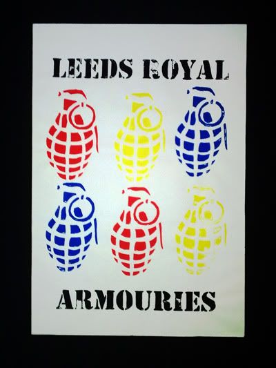
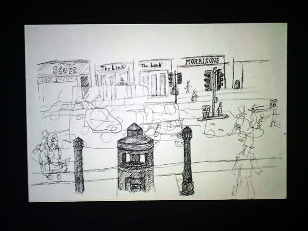
A simple poster for the Leeds Royal Armouries (doy) but I wanted to remember it as I really like the textured and imperfect paint effect gained from silk-screen printing. I also like the use of a limited colour pallette: less is more.


The below illustration was something I did in a sort of side "art history" / "experimentation" class, if I recall correctly. In this piece I wanted to capture still as well as movement, so drew in detail what remained still, and clearly (or not), the motion objects such as vehicles and people, became mere shapes and blurs.

Photobucket

Sunday 4 July 2010

Older Motion Pieces

____Just a couple of stop-frame pieces from earlier years of University.
The first was done in my first year in a group of 6 people, with 4 days to come up with the idea, film it, and edit it! We had to choose a topic to advertise out of a list of about 10 options. We chose shoes/trainers.


____The second was shot in my second year of uni with just one other person, a genius named Gemma Hurst.. We had to create a motion piece for a radio station, hence, Heart FM. Whiteboard animation.
The music may be blocked in this video as Lovely Day by Bill Withers is apparantly too lovely to share with the world.


Saturday 3 July 2010

Brighton Film Workshop

____This was a piece I storyboarded and directed whilst at a day film workshop in Brighton. We were given a couple of hours theory in the morning, then over our lunchhour, had to storyboard out the camera angles, etc, from a script from a film (we had 3 script scenes to choose from, I chose a scene from American Beauty). I had seen it, but only once, and years ago, so I had well and truly forgotten what the scene really looked like. I then had an hour to direct the camera, lighting, movement, and the actors.

Below is the edited footage of what I shot in my hour of directing.
I wanted one more shot of the very last section, from an angle over her shoulder looking at him, but due to timing, this is what I got done. I also got to use the boom when I wasn't directing, and to be the camera(wo)man in someone else's piece.


I was very pleased with the outcome for a first piece of filming I'd ever done/directed! They edited the footage together and posted it to me on a disc at a later date. Somehow, they edited it exactly how I wanted it, despite never seeing my storyboard. Dead chuffed.

Would definitely recommend Brighton Film Workshops to anyone else. I can't wait to save up and return to do another workshop with them.

Gamecity

____The final project of my university course: Gamecity. My concept was to encourage people to feel 'involved' in the annual Nottingham festival, and by doing so I wanted to literally put human beings into classic games. I liked the authentic feel of those original games, that were slightly pixellated, and not-too-polished unlike today's games. At the same time though, I had a wide age-range to cover but wanted to make pieces of work for everyone: humour. By using humour, I felt that this would involve everyone, catch everyone's eye and hopefully keep everyone's attention as well as be a memorable piece of film.

Below are my 2 final pieces!


I am really pleased with how the game overlaying graphics turned out as they came out pretty precise to the original game. My roommate and coursemate (aka the characters of the game) hate me just a little bit now!
I'm also very happy with how the stop-frame animation worked out with the rest of the idea. The choppiness of the movements coincide with the 'retro' game concept and give it a lot more character than if it were just straight filmed, in my opinion.


I wish for this I had stuck closer to a racing game in particular. One that was later suggested to me was comparing it to Mario Kart! Wish I'd done more specific research on racing games at the start. It was also quite hard to judge the time it would take the "racing cars" (plastic chairs) to cover a certain distance across Market Square, and there is a big gap inbetween the female knocking the male's car(chair) over.

____Looking back I wish I'd gotten her to do a trick/wheelie on her chair/car to add something else into the mix where there's a break. Never the less, I am happy with how it turned out, I must just remember in future to do more specific research e.g how the graphics were that precise in the Pokémon game, do the same for this one, based on a certain racing game rather than taking features of different ones.

We also got lots of funny looks.

Many thanks to Nottinghamshire County Council for allowing me to film both these loony happenings in the Nottingham Market Square.


____Going back to the beginning of this project, I created some animatics for each idea, shown below, including a third one of a 'Tekken' (fighting game) spoof which never made it to filming due to lack of time and people being busy with exams, but the brief stated we only needed 2 final motion pieces anyway. I still would of loved to have filmed that stop-motion piece anyway.


____The Tekken spoof would of using the same concept as the other ideas: human-beings in games, filmed in the Market Square environment (because that is where the Gamecity festival is held and also because it's a nice effect to see the public popping in and out of the shot!), with the Tekken gameplay-graphics overlayed on the stop-frame animation. In this one, it would of had fantastic exaggeration of moves (just like in Tekken, but perhaps even more so) such as when someone is punched, they go absolutely flying, and even in this animatic (slight mockery) one player blows at the other, and the other one is knocked over.


____Finally, a development piece for the Racing Game animation: basically the bit before I added in a bunch more sound effects, some graphics etc. This was what I had done at the point where the friends that wanted to see what they looked like flying about on plastic chairs in the middle of the Market Square said "let's see it already!"

Tuesday 15 June 2010

Cartoon Network

____Onto Cartoon Network! My favourite project so far. The task was to create a motion campaign piece to encourage children to not only use their imagination, but to do something with it. I created a quick and simple character that I thought a child may have been able to come up with, and then visualised him in various ideas.

First, the final product:


I really enjoyed creating this animation, and it made me realise how much I love 2D hand-drawn animation. I never thought I could do it so easily but I just went with it and this is what I came up with. I shot the stop-framed hand (my own) on my own as everyone was busy and I had my own visualisation of how it should be anyway. The only issue I have with it is the camera jiggling about when I pressed the button. Easily re-done with a camera that can use an electronic release!

____At this point I also had no experience of Adobe After Effects and I was on a time limit, so with no time to learn, and just Photoshop and Windows Movie Maker at my mercy, to work I went! I took each stop-framed photograph of my hand and the pencil, and Photoshopped the character onto each frame, making it up to just over 400 frames.

The sound effects are mostly me. Especially the voices. Yes o.O


Back to the beginning! Animatics. I really enjoyed storyboarding these out and playing them together to see the results:


After the animatics, came the testing. I wasn't sure how this idea was going to even work, but, using common sense.. and Photoshop, I produced the following. The first test is a quick idea of how the animated character might interact with the stop-framed pencil, which I think went rather smoothly!


The second test below is just an idea of how "Animatic 3" could work if taken further. The 2D characters would of been Photoshopped over the playdoh blobs which keep the pencils and other tools in place as if being held up by the characters.


I'm glad I went with the idea I did. This one would of been very interesting to create, but much more difficult. Plus I really like the interaction between animator and cartoon character which my final idea had, as well as the exclusiveness of the one character, where as this one was used many of the same character idea. I'm pleased with the outcome of the concept as well as the method. I think it worked really well for the brief's target audience and gets the message across in a creative and memorable way too.

Lifeline

____The second set project was a quick one: to use any method to encourage those in distress to call the Lifeline helpline. Of course, I chose an animation..

I struggled with ideas for this for a while, trying to overcome whatever is the animator's equivalent for writer's block! Then all of a sudden I was listening to that wonderful Papa Roach song.. and a lyric hit me as I walked out the door to my tutorial.

"a paper man cut into shreds by his own pair of scissors"

I felt this gave off not only an almost suicidal/self-harming metaphor, but also a really creative visual image of an actual paper man. This lead me to the idea of making a paper chain of men as well as various other paper ideas.

____Given time I feel I could have pushed this idea a lot further. Whether that'd be extending the story of what happens to the paper man once he walks out of shot or whether I use another paper idea altogether, such as one I had of using a flip-book.

Also annoyed that my stop-frame animation jiggles about but unfortunately I could not do much about it as my digital camera didn't have an electronic release and I couldn't get hold of one anywhere.

Lifeline FINAL


An animatic of the idea:


Original Development Test:


Further Developed Test:


I almost like this development more than my final because of the "warmth" of the colours in the animation, which for some reason I struggled to re-achieve, and I also preferred the music here, but unfortunately it was deemed too well-known!

Monday 14 June 2010

E4's Monday Night Movies

____The end is nigh and I should have started this blog a long time ago! Better late than never, now I finally have time to do these extra things ^^

I'm going to use this space to pop up my final videos from the past year's work, as well as older pieces of work. I may even add my opinions of awesome things I find dotting about, and maybe even my random thoughts on occasion.. lucky you.

Starting at the beginning, the first project set was to create motion graphic adverts for E4's Monday Night Movies strand. We were told the movies to be shown on these were the classic 'cheese' e.g Ghostbusters, Crocodile Dundee, etc, and while so terrible they were but we still can't resist watching them. The 'irresistible' idea was where my concept originated and from this I came up with the irresistible red "do not press" button. I created a variety of short sequences, all with this red button, which advertised each genre of film, e.g comedy, sci-fi, horror.

.. and this is what I came up with!

E4 Monday Night Movie's FINAL (Comedy)


E4 Monday Night Movie's FINAL (Sci-Fi)


Development works for this project are shown below. It originated as a cartoon button drawn on a whiteboard, but this did not look irresistible enough.


The below development is almost the final of the comedy advert, but before I had applied the cracked glass effect in Adobe After Effects.


At the early ideas stage, I originally came up with the idea that the films are so irresistible that you are literally dragged towards them, whether you like it or not. This idea became visual in this animatic:


Looking back, I really wish I'd followed through on this idea and would still like to pursue it in my spare time.

In future I need to be more confident with my initial ideas, getting them visual as soon as possible in as many forms as possible, and also to follow through on ideas even though I fear they may be tricky to film.