Sunday 27 March 2011

CV and Business Card

____Since I've actually had these ready for a long while now (although it is continuously being updated), I thought I ought to put my hand-out CV and business card on here for show.

Photobucket

Photobucket

The scanimation theme was because of my genuine love of it, motion graphics, optical illusion, Eadweard Muybridge and Stefan Sagmeister. I thought it'd be great to be able to put some movement into a print-out in order to stand out myself.


Photobucket

Why the butterfly? I think the idea originated from the caterpillar > cacoon > butterfly as a symbolism for me going through college > university > working life.
Plus it makes a great and easily recognisable silhouette image, which, being a butterfly, is related to beauty and positivity.


Photobucket

The butterfly scanimation is continued into the smaller dimensions of the business card, which continues to work well with the provided piece of acetate (containing the purpose printed lines created for the butterfly to make its move).

Photobucket

Heidi Klein Photoshopping

____I recently had an interview for a design job after which I was then given the task of Photoshopping certain items of clothing (colour changes, removing logos, that sort of thing).

Thanks Heidi Klein for this opportunity. The work I completed for the editing task can be found below.

The 'before' images are on the left, with the edited 'after' imagery by me, the right.


Photobucket

The first task was to darken this model's skin colour, which was simply done by altering the hue/saturation of the image. I managed to do this without selecting all her skin individually as her bikini is already white which means it would hardly change colour if the hue/saturation was changed.


Photobucket

Another colour change, this time her dress had to become the plum colour alternative. Using the website as reference for the colour, I used the magic wand tool to select some of the print on her dress and then by 'selecting similar', it automatically picked out (mostly) the remaining pattern of her dress. Once selected, it was then easy to change the hue and saturation once again to get the correct tone.


Photobucket

This piece became more tricky as I had to cut-out the garment from the model.
Erasing her head and arm and legs weren't a problem at all, but I had to be particular if I wanted this to look genuine. Using a mixture of paint tools, blurring, sharpening, burning, dodging and patching tools, I carefully edited in the 'back' of the dress seen on the sleeve and neck.


Photobucket
Again, another task to cut-out of the garment from the model or mannequin in this case, but also this time, to edit out the logo covering part of the poncho's skirt. A repeat performance of erasing the body parts and creating fake 'backs' to the neck, and then using another mixture of patching tools, dodging, burning tools, etc, and finally a very light opacity paint wash of the original colour to blend it all back together. I feel this one came out quite well.


Photobucket

I thought this one was going to be incredibly difficult but I was pleasantly surprised! A simple colour change from black to white was all that was needed here. Selecting the dress using the magic wand tool and playing around with the contrast and brightness tool, I was careful not to whiten the dress out beyond recognition from the white background, but I also wanted to be able to keep the defining and embossing line patterns on the dress which I feel is important to be able to see.


Photobucket
The final image required the image to be made suitable for the website.
It needed the bangles brightening up definitely, but more importantly, that background needed sorting out! I ended up carefully using the pen tool to draw around them, erasing the whole background including the shadows, then, once the bangles were separated from the background, brought in the original image on another layer and wacked up the brightness so that the background would become cleaner and whiter with paler shadowing. The bangles I had cut around originally I then laid over the top and brightened up by altering the brightness, contrast and saturation tools.

Take that, bad lighting!

Sunday 13 March 2011

Adobe Creative Juices

____It's been quite a while since I last posted which is because I gained a full-time job in September which is taking up much of my time! I wanted to post something I've been doing this morning of which I received in my email today:

Adobe Creative Juices Logo Competition


Below are some ideas I did quickly in my sketchbook.

Photobucket

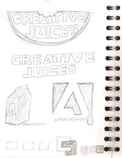
Taking the 'juice' part literally, I thought of fruit juice, and then came up with this melon slice shape, but after browsing through the entries that have already been submitted I saw a very similar idea done on an orange, so I decided to push this one aside.
I then pursued the fruit 'juice' idea and looked at cartons, juice drips.. and then realised their current logo is purely the initials of the brandname. I then played about which how the letters could work together to improve on what they already had.

..Which lead me to the below.

Photobucket

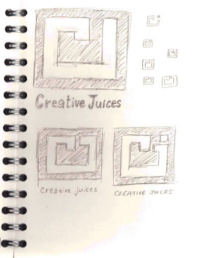
Looking at the original 'Adobe' logo, it used straight lines and the surrounding red box with the white letter 'A' bleeding over into the white background. I played around with the same principals and this lead me to come up with the following designs.

Photobucket

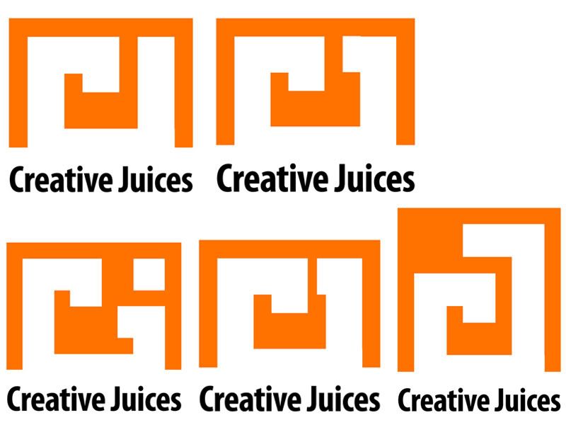
I like the fact that they all resemble a swirl until you read into them and see that they are initials, however, the two on the left side seem to be read "CI", where as the one of the bottom-right doesn't immediately resemble a 'J' quite as easily as the two central ones. So it's between the 2 central designs for me, unless they can be improved further. I'm not 100% sure whether or not Adobe may want something totally different to what they already have logo-wise, but I feel I need to stick to their principals of logo-design somewhat to keep within the consistancy.

Will update if I come up with more solutions!